Macro F1, standard deviation 0.015 across five successive tests.
Out of 100 existing plantations, the model points to 90.
When it calls palm, it is right about 87 times out of 100.
The radar feature carries 5.2 times the signal of the best optical one.
The demo
See it run
Two recordings of the model running for real on the same four places: a plantation, a natural rainforest, a false alarm left in on purpose, and a point far outside the area it was tested on. Every number is computed live; only the waits are sped up.
The YouTube player only loads when you press play.
The use
What it lets you do
Knowing where oil palm plantations are is a precondition for almost everything else: tracking deforestation, auditing a concession, deciding where to send a team. In the Democratic Republic of the Congo that information exists nowhere in a reliable, up to date form, and the country is far too large to go and check everywhere.
Classi-fy narrows that field. For any given plot, it gives the probability that it holds palm, from free and public satellite imagery.
Its main use is prioritisation. Rather than working through a hundred sites at random, you rank them by decreasing probability and start with the ones that most deserve attention. A team with ten field trips available spends them better.
The model produces a signal, not a verdict. It replaces no verification, it says where to look first.
The problem
Why this is hard
Seen from an optical satellite, which measures the light bouncing back off the ground, an oil palm plantation and dense tropical forest look remarkably alike. Both are closed canopies, green all year round, and their greenness shifts with the seasons by similar amounts.
That is the core difficulty. A model learning to separate these two canopies risks leaning not on what actually distinguishes them, but on details specific to the region it learned in: the particular tint of a soil, the haze of one season, the date a picture was taken.
Those details work perfectly where the model was trained and are worth nothing anywhere else. Hence the question that shaped the whole project: does this model still work in a region it has never set foot in?
The evaluation
How I evaluated the model
Answering that question takes more than the usual way of testing a model, which is to set aside a share of the examples at random and use them as the exam. In remote sensing the trouble is that two neighbouring plots look very much alike: same soil, same weather, often the very same satellite image. With a random split, near identical plots end up on both sides, and the model is graded on situations very close to ones it has already seen.
So I cut the territory into geographic blocks of 100 km, and made sure each block sat entirely on one side of the split. The model learns on some regions and sits its exam on others, which it is discovering.
The two ways of measuring give different numbers, and the gap between them is itself informative.
Figure 1: the gap narrows as the model gets better
Score from 0 to 1. The solid bar is the score on unseen regions. The hatched extension is what the easier exam added on top. The dotted line marks the score of a model that always answered the majority category.
With optical imagery alone, a large share of what the model appeared to have learned did not travel from one region to another. That diagnosis was useful: it did not say the problem was unsolvable, it said a signal of a different nature was missing.
The solution
What changed the result
Optical imagery measures colour. What was needed was something that measures shape.
Satellite radar does not photograph the landscape: it sends out a wave and listens to the echo. What it picks up is the structure of the canopy. A plantation has trees in rows, of even height, and sends back a regular echo. A natural forest is disorderly, and so is its echo.
Where optical imagery saw no difference, radar measures one. It also has a practical advantage: it goes through clouds. Over a region that is overcast much of the year, that is the difference between usable data and no data at all.
With radar, and with the question reduced to two categories, palm or no palm, the score on unseen regions reaches 0.821, measured across five successive tests, each on different regions.
Figure 2: radar carries most of the signal
What the model loses when one feature is scrambled at random. Measured on the test plots, in blocks it had not seen.
The maps
The maps also show what the model misses
A score summarises, it does not show. So I mapped the results of the evaluation. These maps display the test points themselves, the ones performance was measured on. Each point is a plot, and its colour says what the model made of it.
Reading the map colours
The first two cases are successes, the next two are errors. It is the errors that would call for human verification, and it is to make them visible that the map exists.
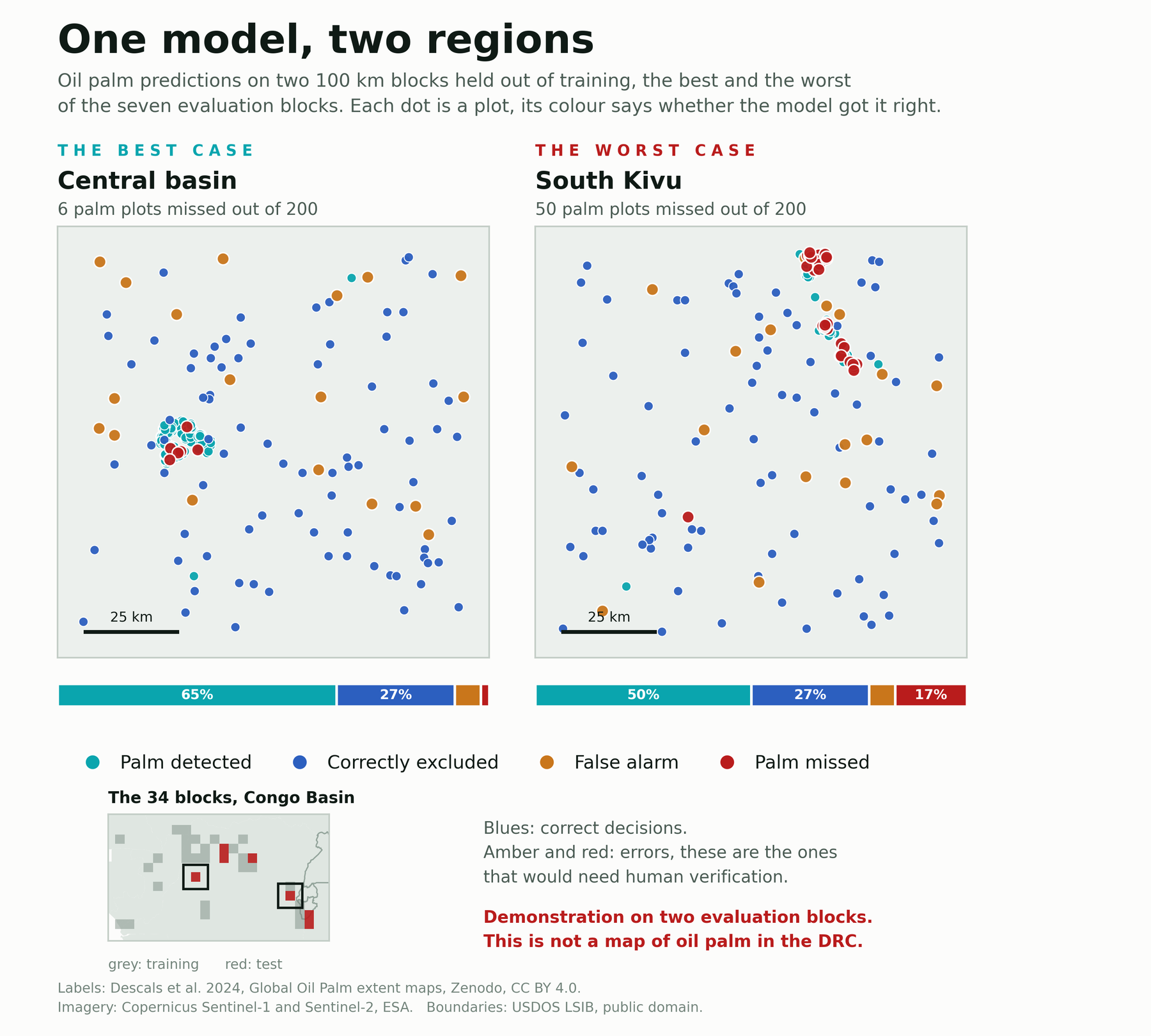
These maps show the test points Classi-fy was evaluated on. They are not a continuous prediction map, and they do not yet describe the full range of landscapes in the DRC.
The choice
Why I show the bad block
In the central basin, the model misses 6 plantations out of 200. In South Kivu, it misses 50 out of 200.
Showing the bad block is deliberate. A model does not behave the same way everywhere, and presenting only the region where it shines would give a false picture of what to expect from it.
The gap between these two maps is useful information for anyone who might want to use it: it says that local verification remains necessary before trusting the model in a given area.
The numbers
What the numbers say
Now that the maps can be read, the numbers make sense. Across all the test plots, spread over regions the model had never seen:
Put in practical terms: out of 100 existing plantations, the model flags 90. When it calls palm, it is right in roughly 87 cases out of 100.
That is exactly the profile of a prioritisation tool. It narrows the field to examine sharply, without closing it entirely. The 107 missed plantations are a reminder that no signal is not proof of absence, and the 146 false alarms that a signal still has to be confirmed.
The field
What the ranking is worth
A score says whether the model is right. It does not say what you gain by using it. A mission lead asks something else: if I visit plots in the model's order, how many plantations will I have found after a quarter of the visits?
So I ranked the 8,658 plots by decreasing probability, then counted. To find half the plantations you have to walk through 32% of the list. Visiting at random, with no model, would take 50%. And a perfect ranking, one that put every plantation at the top, would need 30%: over that stretch, the model sits two points off the optimum.
The gain then narrows. To find nine plantations in ten you still need 67% of the list, against 90% at random. That is the expected behaviour of a prioritisation tool: it pays heavily on the first visits, and less and less as you push towards completeness.
This gain is not the same everywhere. Block by block, the share of plantations flagged has a median of 90%, but three blocks out of 34 fall below 70%, the weakest at 58%. It is that spread, not the average, that decides whether the ranking is usable in a given region.
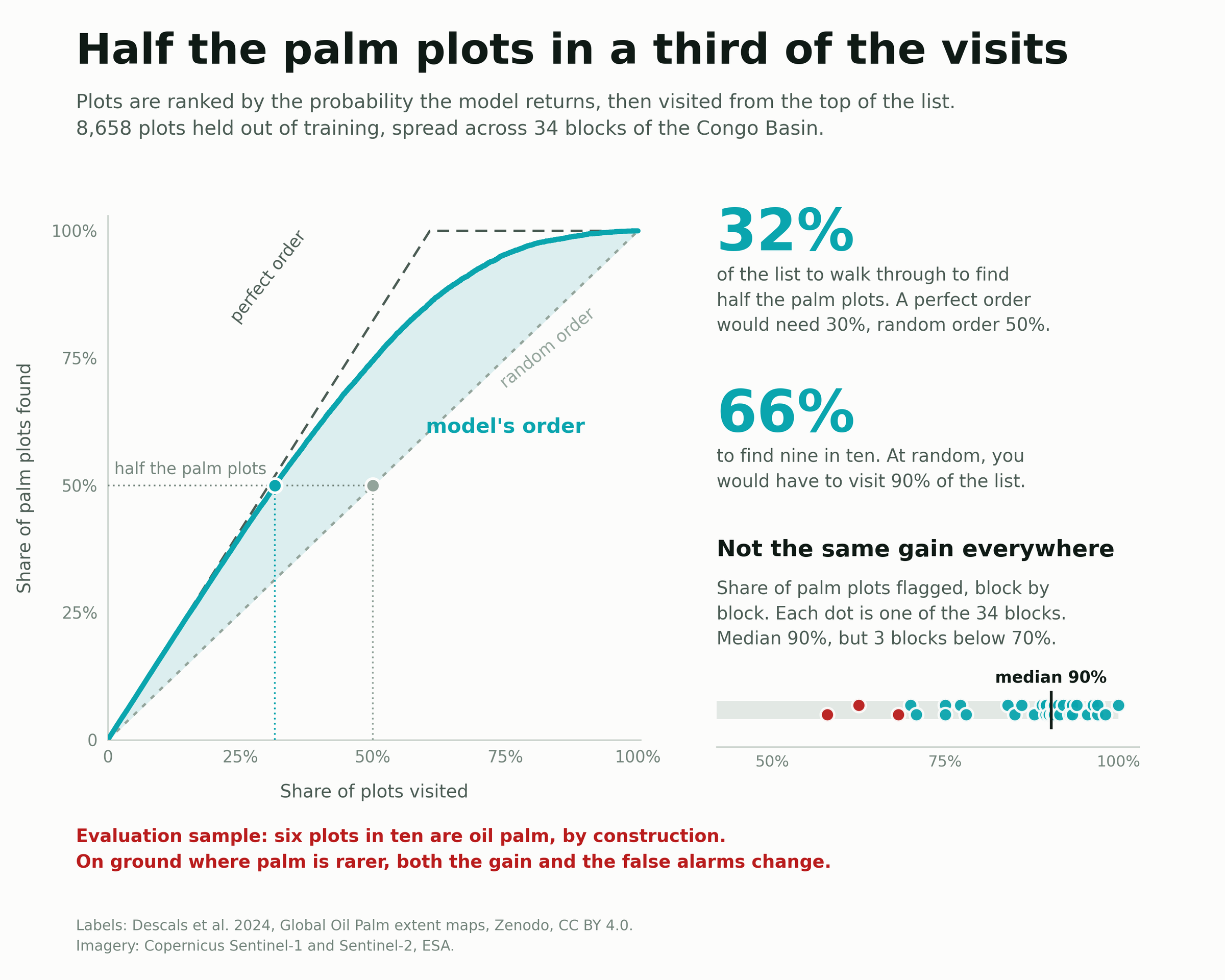
The sample holds six palm plots in ten, because sampling targeted the areas where palm is found. On real ground, where it is far rarer, both the sorting gain and the cost of false alarms would be different.
The prototype
What the list looks like on the ground
A ranked list is still a list. To prepare a round of visits you have to see it: where the priority plots are, whether they cluster, how much is ruled out from the start.
So I drew the prototype on one block, in Sud-Ubangi. Its 200 plots fall into three decisions rather than four confusion matrix colours, because a round of visits has only three outcomes: go there first, look at it next, leave it. The upper threshold is 0.8, the lower one 0.4.
The right hand panel is the safeguard for the left hand one. A priority map on its own would suggest that a colour amounts to a confirmation. The bars state what each band actually holds: 95% palm above 0.8, 77% between 0.6 and 0.8, 53% between 0.4 and 0.6, 7% below 0.2. The sample average, 61%, gives the yardstick without which those figures mean nothing.
This is a prototype, not a tool. Its purpose is to settle what a mission map should be made of before building one.
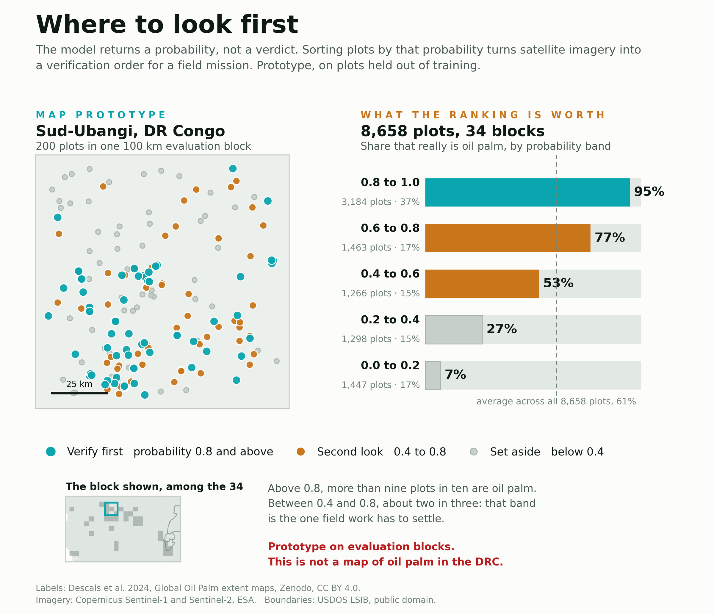
Prototype drawn on one evaluation block. This is not a map of oil palm in the DRC, and a high probability does not, on its own, confirm that palm is present.
The limits
What the model cannot do yet
This model is not yet built to fill in a continuous map of the DRC.
The reason lies in how it learned. Its no palm category does not represent the whole range of Congolese landscapes: it represents what surrounds plantations, which is mostly forest and neighbouring crops.
Applied to an entire territory, it would run into rivers, villages, bare soil, dry savanna, high ground. All environments it never had the chance to learn to rule out. Its behaviour there is unknown, and nothing lets us claim it would be reliable.
Publishing a prediction layer covering the whole country would therefore be misleading, even with a disclaimer attached: the image would be beautiful and the information wrong. The map of test points, on the other hand, is honest, because it shows precisely the domain in which performance was measured.
Two further limits are worth knowing. The model does not tell an industrial plantation from a smallholder grove, because what separates them is the geometry of the planting rather than what a satellite sees point by point. And the labels it used as its reference come from a mapping effort of their own, with its own errors, which Classi-fy inherits without correcting them.
What is next
Four pieces of work, in this order
Broaden the no palm environments
Teach the model to recognise savanna, towns, mountains and wetlands. This is what is missing most.
Respect how rare palm really is
In my dataset palm is very common, because the sampling targeted the areas where it grows. Across the real territory it covers a fraction of a percent. A model meant to cover a country has to be trained and tuned at those proportions.
Add terrain and texture
Elevation and slope rule out, straight away, areas where palm does not grow. Texture features, which describe how the canopy is organised in space, are the only serious avenue for telling an industrial plantation from a smallholder grove.
Obtain ground truth labels
This is the only way to measure real performance rather than agreement with someone else's mapping work.
To close
A tool to prepare fieldwork, not to replace it
Classi-fy helps prepare a human check: it points out the places to look at first and rules out a large share of the rest. It does not replace fieldwork, and on regions it has not learned, it says nothing reliable.
What I take from this project is less the number reached than the way of reaching it. Evaluating on disjoint regions costs a few points of headline score, and gives back something more useful: knowing where the model holds and where it does not.
Method
The detail, for anyone who wants to check
- Reference
- Oil palm extent maps from Descals et al. 2024, published on Zenodo under CC BY 4.0, at 10 metre resolution and validated in the field. They distinguish industrial palm, smallholder palm and no palm.
- Sample
- 8,658 points spread over 34 blocks of 100 km, between 12.1 and 30.1 degrees east and between -4.9 and 4.0 degrees north. That covers the width of the Congo Basin, with 24 blocks in the Democratic Republic of the Congo and 10 across six neighbouring countries.
- Imagery
- Sentinel-2 for optical, six bands from the visible to the shortwave infrared, clouds and shadows masked. Sentinel-1 for radar, VV and VH polarisations. Reference year 2021, one value per month per band, that is 96 measurements per point.
- Features
- 34 annual features summarising those measurements: vegetation indices and their statistics, per band means and variability, and the difference between the two radar polarisations, which turned out to be the most informative of all.
- Evaluation
- Spatial block cross validation, five folds, the group being the 100 km block. Headline score, macro F1 of 0.821 with a standard deviation of 0.015 across the five folds. A model always answering the majority category would score 0.378 on the same data.
- Models
- Random forest and gradient boosting land within five thousandths of each other, which says the performance comes from the features chosen and not from the algorithm.
- Tools
- Python, Google Earth Engine, scikit-learn, geopandas, rasterio, pandas.
Sources: Descals, A. et al. (2024), Global Oil Palm extent maps, Zenodo, CC BY 4.0 · Copernicus Sentinel-1 and Sentinel-2, European Space Agency · USDOS LSIB administrative boundaries, public domain.